At the start of Unit 2, I was still struggling to find which path I wanted to take. I had taken a series of photographs of my then boyfriend, using a red light, which I intended to use as a basis for a series of “red” paintings. The idea was to figure how to construct a narrative with these images around the same space, in this case a living room. I was still working with the theme of voyeurism, and how I could convey the sense of intrusion into private thoughts or a private moment. In addition to this, I wanted the narrative to be ambiguous, so for example in one of the experimental paintings I only painted a pair of legs on the sofa. Therefore, I used cropping to achieve the desired effect. I found myself feeling quite limited by the use of the colour red, and while I had initially thought it could be useful in terms of creating a certain mood or atmosphere, I did not feel that it ended up adding much to the painting. The only positive I found was that it forced me to be more expressive with my brushstroke in the portrait.
After these experimental paintings, I decided to find another avenue for expressing the themes I was interested in, focusing on voyeurism, the domestic interior, and loneliness. I made several digital collages combining some photos of my ex with an interior I had found online. I was interested in the idea of this continuous space with several narratives happening at once in it. For this I drew inspiration from Francis Bacon, and in particular his triptychs which I’ve always admired. I liked the idea of this figure in some sort of motion in space, but unlike Bacon’s triptychs I felt that mine had a sense of quiet, calm loneliness, due to the cold colours I chose for the collages. During one of the critiques, it was suggested that I might explore the idea of a gendered approach of representing these spaces. Because the figure in my collages was male, it almost looked like a sort of “toppled Adonis.” I then began reading an essay about gendered space, which also tied into the idea of voyeurism and the seen/unseen which the architecture of a house can control. An interesting point made by the architect Loos is that the room , if we’re thinking of rooms as a theatre box, exist “at the intersection between claustrophobia and agoraphobia” (Colomina 1992, p.76). This is an idea that was very close to what I wanted to achieve, because I was thinking about themes of isolation but also being trapped in a space: “security is not achieved by simply turning one’s back on the exterior and immersing oneself in a private universe” (Colomina 1992, p.80). The domestic space for Loos is a place where “the inhabitants of [the] houses are both actors in and spectators of the family scene- involved in, yet detached from, their own space” (Colomina 1992, p.80).
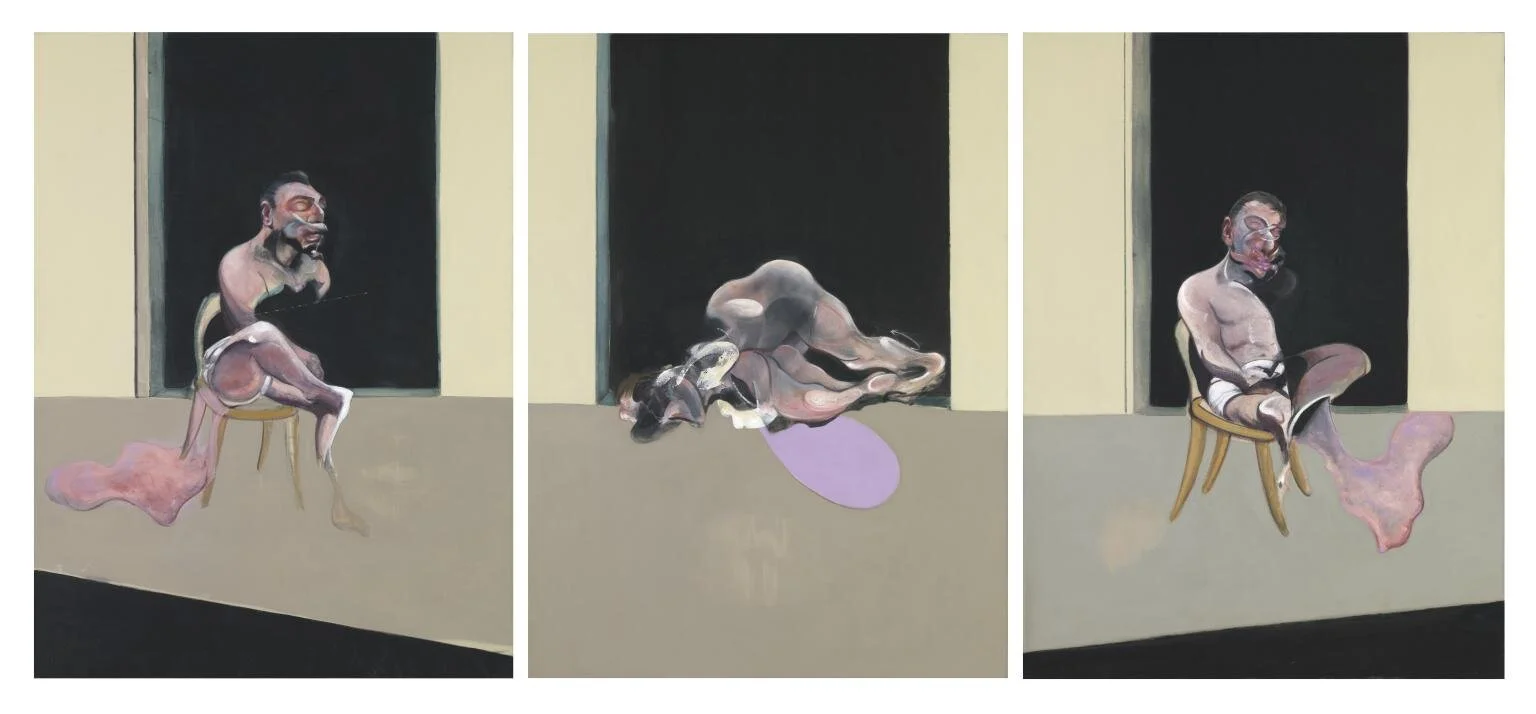
Triptych August 1972, Francis Bacon, 1972.
I started doing more research on the significance of rooms and the domestic space, and did research on a Polish artist called Joanna Piotrowska who had been featured in an exhibition titled Room a few years ago. The blurb for the exhibition seemed to encapsulate what I was interested in:
Within and between the different works in Room, the domestic interior is examined (as in Gilman’s story) in many guises – as a place of retreat, an index of style, a site of display, a metaphor for the mind, an expression of the mundane, or a vessel for the uncanny (Coles, para. 4)
Ideas about intimacy and the relation to power struggles in the domestic space are central to Piotrowska’s work. She will often stage the gestures in her photographs but the subjects will have a real life relationship:
My works inspired by Family Constellation are entirely staged, with the same movements sometimes repeated before the camera many times. That element of artifice of staging simple and sometimes quite intimate moments combines well with the authenticity of domestic spaces and the very real family members I work with. I believe this combination of staged and real largely contributes to the uncanny atmospheres I portray ( Greenberger 20202, para.8)
In the push and pull of the rapport between subjects in her photos there is the key theme of the roles we play in the domestic sphere, which relates to what I was researching previously about the idea of masculine and feminine spaces in the home:
I was thinking about shifting roles. The project is based on a game in which children play adults, yet in the images, we see adults playing a children’s game. That shift from childhood to adulthood, from present to past, is also a touchstone in one of my earlier series in which I asked adults to repeat gestures taken from their childhood images (Greenberger 2020, para.12)
I also found it interesting that her photographs were in black and white, which she uses as a way to take away the barrier between reality and fiction, but also to blend the tones to create a more uncanny image. This is something I had sought to do in my digital collages, by matching the figure’s skin tone to the grey interior it was placed in.

Untitled, Joanna Piotrowska, 2014.
In tandem, I became fascinated with the work of the American artist Francesca Woodman. Her photographs, also in black and white, are on a small scale, which makes them feel more intimate. There is a very delicate quality to her work. “The images convey an underlying sense of human fragility. This fragility is exaggerated by the fact that the photographs are printed on a very small scale – they seem personal and intimate.” (Tate, para.7). Another element of her work I found interesting was the attention to detail in the preparation for her photographs, particularly the selection of interiors: “She playfully manipulated light, movement and photographic effects, and used carefully selected props, vintage clothing and decaying interiors to add a mysterious gothic atmosphere to the work.” (Tate, para.9).


Space², Providence, Rhode Island, Francesca Woodman, 1976.
After seeing Woodman’s work, I started thinking about the idea of incorporating more movement in the figure, while keeping the idea of having the figure confined to a certain space. I ended up taking a few nude photographs of myself in various “shielding” positions, to emphasize the vulnerability of the female figure: “Her ghostly presence in the photographs, whether blurred, partially hidden, obscured, camouflaged, fragmented or disguised is intense and powerful. It is sometimes disturbing and most of all, intimate.” (Tate, para.12).
This was something that I wanted to explore, in terms of the dichotomy between the stillness of the male figure and movement of the female figure, both representing a state of vulnerability and isolation in a domestic space. The culmination of this for me was starting a painting in which I combined the images of the female and male figure, each on one end of the canvas. Although I painted them both in the same style, the female figure turned out much more powerful than the male figure. The stillness of the male figure seemed to not translate into painting, or at least for that particular painting style. I decided following a tutor session that I did not want to pursue this particular representational avenue for my painting, as having these abstracted figures in such a large space was too literal a rendition of these feelings of isolation, separation, and loneliness.

Charcoal on paper, 2020.

Oil on canvas, 2020.

A Foreshortening Cliff, Ruozhe Xue, 2016.
Prompted by a tutor, I looked at the work of a Chinese artist called Ruozhe Xue, which explores the idea of the double. His oil paintings have a very surreal quality to them, and the doubled figure is often looking away. There is a very eerie feeling to his work, and I was interested in the uncanniness of the doubling up of the figure. This related to my interest in how to represent the idea of isolation, particularly when relating to the male/female relationship. I thought it was fascinating that the two identical figures could still provoke that sense of isolation.
Another artist I was looking at in terms of how I could visually express these ideas of mine going forward was Michael Borremans. In addition to wanting to express these themes of loneliness and isolation, I was also interesting in conveying a sense of a somewhat stifling domestic space. The way Borremans crops his paintings give a sense of the figures seeming almost trapped in the canvas, they almost seem to be squeezed into the canvas which gives a feeling of suffocation. The figures are also either turned away or looking away from the viewer, making it seem as though they are also trapped in their own thoughts. The muted colour palette, strong light and close cropping plus expressive brushstroke give an impression of inner turmoil.

The Banana, Michael Borremans, 1963.
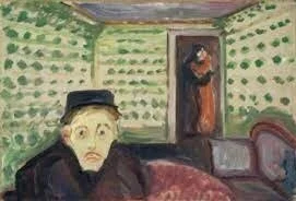
The Green Room, Edvard Munch.
Another technique I was interested in exploring was how colour could be used to express different moods, especially in a domestic setting. In Edvard Munch’s Green Room series, he sets the stage for his relationship with a woman, using the colour green to represent the feeling of jealousy. This is something I kept in mind as a potential other element for how to create a narrative in a domestic setting and expressing certain feelings related to relationships.
In terms of my practical research, I had taken some photographs to explore the idea of perspective in adding an uncomfortable element to the domestic scene. I took these photographs from above to give a fish eye perspective, also inspiring myself from the one-point perspective that Stanley Kubrick uses. I also did some sketches with watercolour to figure out the colour palette I wanted to use for this couples series, settling on a darker bluish background.

Watercolour on paper, 2020.


Furthering my research on the double and the domestic interior, I explored the concept of the artist Gregor Schneider’s twin houses:
For 2004’s Die Familie Schneider, commissioned by Artangel, he converted two adjoining terrace houses in Whitechapel into doppelgängers, building rooms within rooms that were almost exactly parallel to each other, down to the items in the fridge. Visitors were given keys and left to enter alone. Actors performed unhinged, unnerving actions: manically dishwashing, hiding in bin bags, and masturbating in a bathtub, all done as if unobserved (Lloyd 2020, para.3)
I found it fascinating how this idea of doubling can really provoke a sense of unease in people, and how seemingly mundane domestic tasks or activities can turn sinister so quickly. The home is often seen as a place of comfort, of protection, but it can also be the stage for darker things, for things that are lying beneath the surface. As the article I read says, “the ongoing pandemic has made us acutely aware of a home’s shielding function…The walls that protect, however, can also conceal, entrap and disorientate. Schneider’s art often captures these less salubrious effects.” (Lloyd 2020, para.2)
Also, this mirroring of the interiors made me think of how this could relate to the idea of déjà vu, or the doppelganger. It is unnerving to humans to think of themselves, or in this case, the home, as not unique.

Haus u r, Gregor Schneider.

Oil on paper, 2020.
A side project of mine which I started after watching the film Body Heat initially began as an offshoot of the idea of having a couple sitting at a table, either from a fish-eye perspective or having a couple facing each other but from a side on perspective. I began sketching out, then ended up priming some paper and painting on oil with that. I painted a red background which lent a more confrontational element to the painting, but confirmed my experiment about how colours can change the mood of a painting.
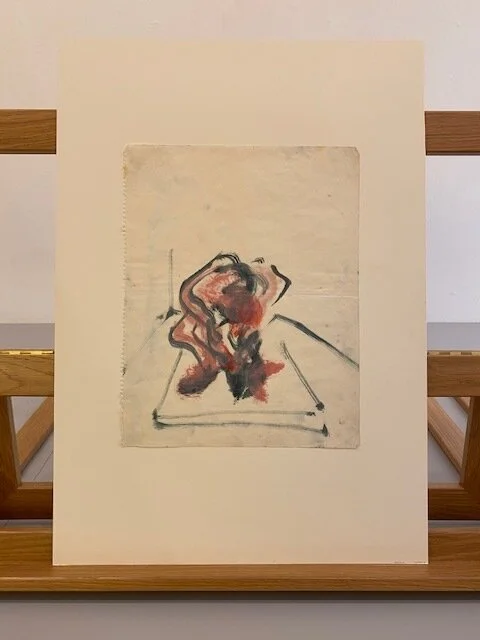
For my external resources research, I went to the Tate Print & Drawings Collection, to look at Francis Bacon’s sketches. I found out that Francis ~Bacon did not admit to many people while he was alive that he did preparatory sketches for anything, as he was afraid it would ruin the image of him as an instinctual painter. However, it later emerged that he did indeed do preparatory sketches, either in the form of pencil sketches, oil paint rapid sketches, or ink sketches (at least in the selection I saw). Although these sketches are very simple, they still contain his trademark style. They inspired me to not be afraid to keep it simple and work on some smaller scale paintings or drawings, which didn’t need to be very detailed.

Prints and drawings, Francis Bacon, TATE Collection.


External Research
Another external resource I found were the Stanley Kubrick Archives at UAL. I had initially been interested in Kubrick’s film direction style in Unit 1, where I looked at techniques he uses such as symmetry and the one-point perspective for stylizing his hots. The archives are numerous, and I had to be very precise about what I wanted to look at during the two hour time slot I had. I mainly asked to look at set photographs, sketches of the set, scene breakdowns, and pre-production files. One thing that struck me, which I had been aware of but never fully grasped, was how absolutely detailed every single element in Kubrick’s films were. I looked at archives from three films: Barry Lyndon, 2001: A Space Odyssey, and The Shining. For 2001: A Space Odyssey, I looked through what must have been hundreds of photographs of planets, which all seemed almost identical with slight rotations of the planets or shifts in the light, which was fascinating in terms of seeing the dedication he put into every single shot. Another example of this attention to detail is the notebooks he kept for the scene breakdowns in the The Shining, where he broke down the scenes to the second, and rated the same line delivery over and over again in the notebook. Something else he did was in depth research into different elements of his films, for example for Barry Lyndon there was a collection magazines about seaside towns, and brochures about antique furniture. I found this very relevant to any art form because it shows that great art doesn’t necessarily happen by chance (or at least great films), and that attention to detail can yield great results. For The Shining, which I think is a prime example of the one-point perspective and symmetry when it comes to the famous corridor scene with the twins, Kubrick made numerous pre-production models of the famous hotel, out of carboard. These maquettes of both the hotel and the garden were photographed also hundreds of times, to see which angle would be better suited for the scene. Certain notes next to these photos said things like “too wide,” or had pen markings to crop them to what Kubrick wanted. The pre-production photographs of The Shining set were also very informative. The hotel entrance hall has three very large archways which look like a triptych painting. There was a photograph taken from a point above looking down into the hotel atrium which created a sense of eerie empty space, and photographs of archways gave a sense of unease, of not being quite sure what’s around the corner. I noticed this same technique in another photograph, this time taken from the bottom of a set of stairs. The angle of the camera meant that we couldn’t see what was at the top of the stairs, which provoked fear and discomfort when looking at it, an element which must have been essential in a horror film like The Shining. Again, the attention to detail even in the maquettes was incredible, and the photographs taken of the interior of the hotel maquette even included cardboard figures complete with drawn on costumes and details like a large belly on one man, and lighting. I learnt a lot by visiting these archives, especially about how much effort one can put into executing one’s vision, and how attention to detail really does pay off.
At the end of Unit 2, and starting Unit 3, I am working on a series of paintings of some friends of mine, taken in their home on their living room sofa. I took photographs of them in various poses on the sofa, and used lighting to create shadows. The canvases I am painting on will be larger, and though I usually use a projector to map out my paintings, I have decided to just sketch roughly and then see where the paint takes me.
References
Colomina, B., 1992. The Split Wall: Domestic Voyeurism. In: B. Colomina, ed., Sexuality & Space. New York: Princeton Architectural Press, pp.73-128.
Tate. n.d. Finding Francesca – Look Closer | Tate. [online] Available at: <https://www.tate.org.uk/art/artists/francesca-woodman-10512/finding-francesca> [Accessed 15 June 2021].
Greenberger, A., 2020. Interview: Joanna Piotrowska on Her Unsettling Photography – ARTnews.com. [online] Artnews.com. Available at: <https://www.artnews.com/art-news/artists/joanna-piotrowska-photographer-interview-1234577521/> [Accessed 15 June 2021].
Lloyd, J., 2020. The Eerie Resonance of Gregor Schneider's Disquieting Interiors - ELEPHANT. [online] ELEPHANT. Available at: <https://elephant.art/the-eerie-resonance-of-gregor-schneiders-disquieting-interiors-22052020/> [Accessed 15 June 2021].
Sadie Coles HQ. n.d. Room. [online] Available at: <https://www.sadiecoles.com/exhibitions/211-room/press_release_text/> [Accessed 15 June 2021].